Designing an App for Multiple Platforms
This is a series of tutorials designed to introduce React Native and its Open Source ecosystem in plain English, written alongside the building of the F8 2016 app for Android and iOS.
One of the major highlights of React Native is its simplicity around creating apps that can run on iOS and Android, without having to repeat most of the app logic in different native languages.
However, rather than "write once, run anywhere", the philosophy of React Native has always been "learn once, write anywhere". This subtle difference means that React Native apps should be tailored for each platform, rather than being identical everywhere.
Platforms can have somewhat different visual styles, UI paradigms, or even technical capabilities. Thus, it makes sense to start with a common UI foundation, and then tweak it for each platform.
Before We Start
In this and subsequent tutorials, we're going to be diving into the code of the app itself, so you should grab the source code and clone it somewhere you can conveniently browse. You could also follow our setup instructions to use this to run the app yourself locally, but for the purposes of this tutorial, you just need to see the source code itself.
The React Native Mindset
Before you write any React code, there is a very important concept about it that instructs how you think about every piece of a React app. This concept is that your code should re-use as much as possible.
This might seem at odds with the React Native idea of tailoring the app visually for each platform - where the temptation might be to create separate iOS and Android visual components - but it simply requires that the various parts of the React Native app still share as much overlap as possible.
When considering visual components in a React Native app, the key to success is to use platform abstractions. The developer and the designer determine a list of re-usable components in the app - such as "button", "container", "list row", "header", etc. - and only where needed do these components deviate from the common version.
Of course, some components are more complex than others, so let's explore some different components in the F8 app.
Varying Smaller Components
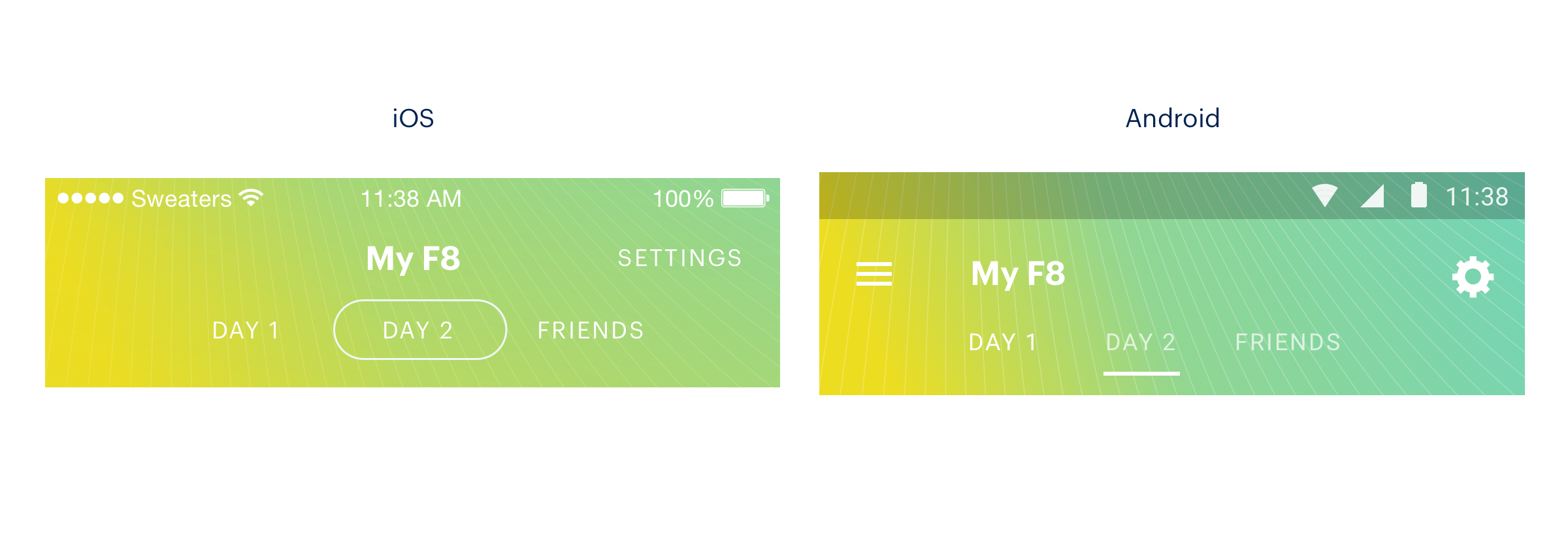
Here is an example from the F8 app:

On iOS, the tab segmentation controls use a rounded button style familiar to iOS users, while the Android version of the same component uses an underline style that better matches that platform. Both controls, however, perform the exact same function.
So, visually they're a little bit different, but otherwise it's worth repeating that they should re-use as much code as possible.
For a small component like this, we have a large amount of cross-platform overlap in the logic involved - it is a component which displays text buttons, each with 'hover' and 'active' styles, and the only difference is that slight visual variation - and so the best approach is to use a single component, and then use control statements when necessary.
Here's the above component as an example (from <F8SegmentedControl>):
/* from js/common/F8SegmentedControl.js */
class Segment extends React.Component {
  props: {
    value: string;
    isSelected: boolean;
    selectionColor: string;
    onPress: () => void;
  };

render() {
    var selectedButtonStyle;
    if (this.props.isSelected) {
      selectedButtonStyle = { borderColor: this.props.selectionColor };
    }
    var deselectedLabelStyle;
    if (!this.props.isSelected && Platform.OS === 'android') {
      deselectedLabelStyle = styles.deselectedLabel;
    }
    var title = this.props.value && this.props.value.toUpperCase();

    var accessibilityTraits = ['button'];
    if (this.props.isSelected) {
      accessibilityTraits.push('selected');
    }

    return (
      <TouchableOpacity
        accessibilityTraits={accessibilityTraits}
        activeOpacity={0.8}
        onPress={this.props.onPress}
        style={[styles.button, selectedButtonStyle]}>
        <Text style={[styles.label, deselectedLabelStyle]}>
          {title}
        </Text>
      </TouchableOpacity>
    );
  }
}
Here we're simply applying different styles depending on which platform the code runs (using React Native's Platform module). Both tab buttons receive some common styles, but then they diverge (again from <F8SegmentedControl>):
/* from js/common/F8SegmentedControl.js */
var styles = F8StyleSheet.create({
  container: {
    flexDirection: 'row',
    backgroundColor: 'transparent',
    ios: {
      paddingBottom: 6,
      justifyContent: 'center',
      alignItems: 'center',
    },
    android: {
      paddingLeft: 60,
    },
  },
  button: {
    borderColor: 'transparent',
    alignItems: 'center',
    justifyContent: 'center',
    backgroundColor: 'transparent',
    ios: {
      height: HEIGHT,
      paddingHorizontal: 20,
      borderRadius: HEIGHT / 2,
      borderWidth: 1,
    },
    android: {
      paddingBottom: 6,
      paddingHorizontal: 10,
      borderBottomWidth: 3,
      marginRight: 10,
    },
  },
  label: {
    letterSpacing: 1,
    fontSize: 12,
    color: 'white',
  },
  deselectedLabel: {
    color: 'rgba(255, 255, 255, 0.7)',
  },
});
Here we're using an adapted version of the React Native StyleSheet API that we've wrapped with some addition platform specific switching:
export function create(styles: Object): {[name: string]: number} {
  const platformStyles = {};
  Object.keys(styles).forEach((name) => {
    let {ios, android, ...style} = {...styles[name]};
    if (ios && Platform.OS === 'ios') {
      style = {...style, ...ios};
    }
    if (android && Platform.OS === 'android') {
      style = {...style, ...android};
    }
    platformStyles[name] = style;
  });
  return StyleSheet.create(platformStyles);
}
In this F8StyleSheet function we parse a supplied object (the styles object from the previous code sample), and if we find a key called ios or android which matches the current platform the app is running on, we use those styles, otherwise they're ignored. This gives us another simple example of the React idea of reducing code duplication by reusing as much of the common styling code as possible.
So now, we can reuse this component in the app, and it will use appropriate styles for iOS or Android.
Separating Complex Differences
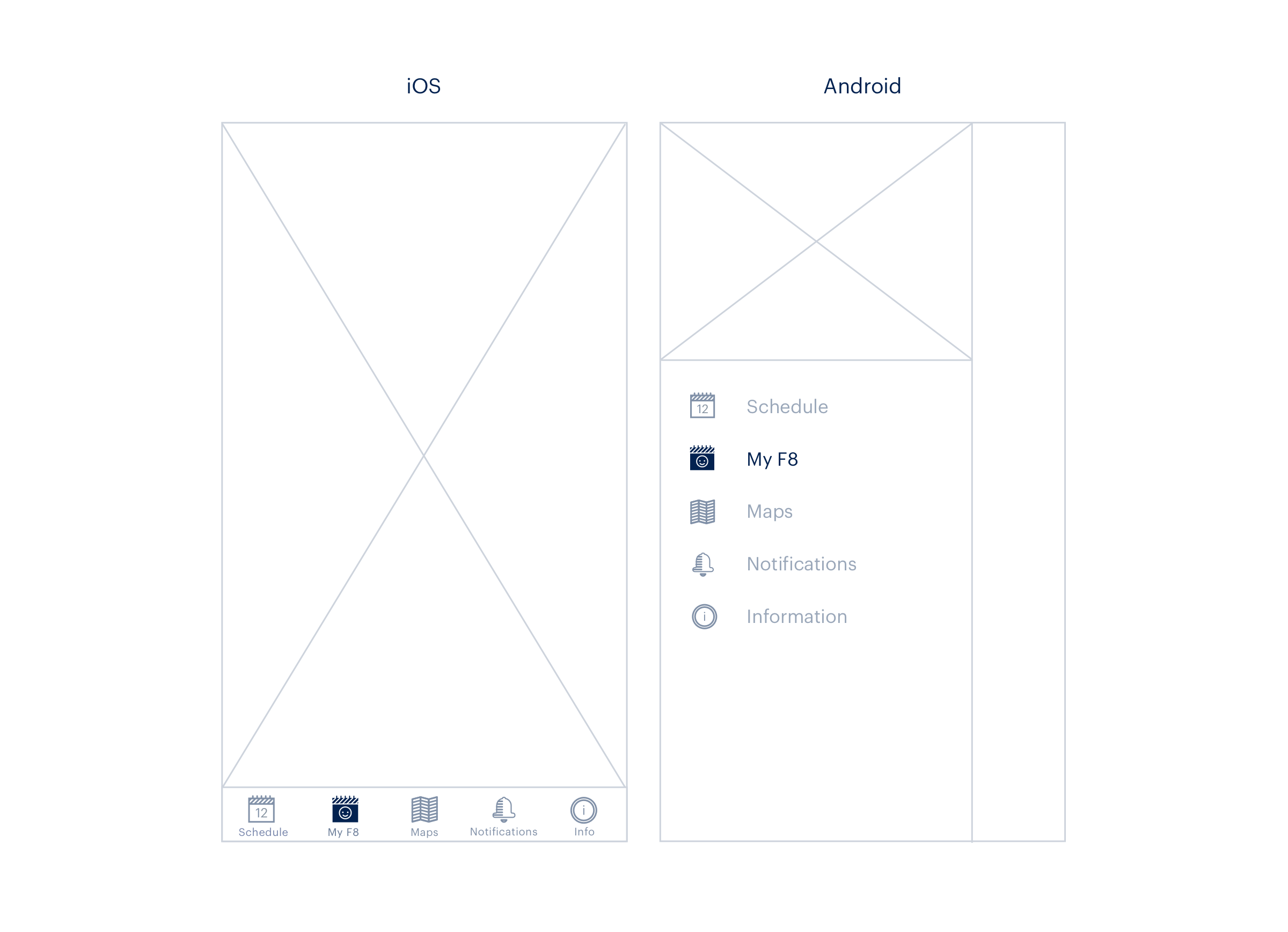
When both platform implementations of a component share less logic and deviate in more than just appearance, we need a different approach. The example here is of the top-level menu navigation in the app:

As you can see, the iOS version uses fixed tabs at the bottom of the screen, whereas the Android version implements a hamburger-type menu with a slide out nav. There are significant differences in terms of extra animation, styling, and even menu items themselves. The Android app, for example, might contain more nav menu options, such as a logout option.
You could continue to use a single component for all of this, but that component's logic would be full of a large number of control statements, and it would rapidly become very difficult to understand.
Instead, we can take advantage of React Native's built-in Platform specific extensions. This lets us create two separate components, in this case one named F8TabsView.ios.js, and another named F8TabsView.android.js - React Native will auto-detect and load the correct component for each platform based on this extension naming.
Built-in UI Components
Within each FBTabsView component, we can also reuse some built-in React Native UI elements. The Android version uses DrawerLayoutAndroid (which, as you can tell by the component name, is only available in Android apps):
/* from js/tabs/F8TabsView.android.js */
render() {
  return (
    <DrawerLayoutAndroid
      ref="drawer"
      drawerWidth={300}
      drawerPosition={DrawerLayoutAndroid.positions.Left}
      renderNavigationView={this.renderNavigationView}>
      <View style={styles.content} key={this.props.activeTab}>
        {this.renderContent()}
      </View>
    </DrawerLayoutAndroid>
  );
}
The renderNavigationView prop passed into DrawerLayoutAndroid tells that component to look for a renderNavigationView() function in the current class. This function should return the content that will be rendered inside of the 'open' drawer. In this case, we're going to render a ScrollView component, filled with custom MenuItem components (see MenuItem.js):
/* from js/tabs/F8TabsView.android.js */
renderNavigationView() {
  ...
  return(
    <ScrollView style={styles.drawer}>
      <MenuItem
        title="Schedule"
        selected={this.props.activeTab === 'schedule'}
        onPress={this.onTabSelect.bind(this, 'schedule')}
        icon={scheduleIcon}
        selectedIcon={scheduleIconSelected}
      />
      <MenuItem
        title="My F8"
        selected={this.props.activeTab === 'my-schedule'}
        onPress={this.onTabSelect.bind(this, 'my-schedule')}
        icon={require('./schedule/img/my-schedule-icon.png')}
        selectedIcon={require('./schedule/img/my-schedule-icon-active.png')}
      />
      <MenuItem
        title="Map"
        selected={this.props.activeTab === 'map'}
        onPress={this.onTabSelect.bind(this, 'map')}
        icon={require('./maps/img/maps-icon.png')}
        selectedIcon={require('./maps/img/maps-icon-active.png')}
      />
      <MenuItem
        title="Notifications"
        selected={this.props.activeTab === 'notifications'}
        onPress={this.onTabSelect.bind(this, 'notifications')}
        badge={this.state.notificationsBadge}
        icon={require('./notifications/img/notifications-icon.png')}
        selectedIcon={require('./notifications/img/notifications-icon-active.png')}
      />
      <MenuItem
        title="Info"
        selected={this.props.activeTab === 'info'}
        onPress={this.onTabSelect.bind(this, 'info')}
        icon={require('./info/img/info-icon.png')}
        selectedIcon={require('./info/img/info-icon-active.png')}
      />
    </ScrollView>
  );
}
By comparison the iOS version uses a different built-in component directly in the render() function, TabBarIOS:
/* from js/tabs/F8TabsView.ios.js */
render() {
  var scheduleIcon = this.props.day === 1
    ? require('./schedule/img/schedule-icon-1.png')
    : require('./schedule/img/schedule-icon-2.png');
  var scheduleIconSelected = this.props.day === 1
    ? require('./schedule/img/schedule-icon-1-active.png')
    : require('./schedule/img/schedule-icon-2-active.png');
  return (
    <TabBarIOS tintColor={F8Colors.darkText}>
      <TabBarItemIOS
        title="Schedule"
        selected={this.props.activeTab === 'schedule'}
        onPress={this.onTabSelect.bind(this, 'schedule')}
        icon={scheduleIcon}
        selectedIcon={scheduleIconSelected}>
        <GeneralScheduleView
          navigator={this.props.navigator}
          onDayChange={this.handleDayChange}
        />
      </TabBarItemIOS>
      <TabBarItemIOS
        title="My F8"
        selected={this.props.activeTab === 'my-schedule'}
        onPress={this.onTabSelect.bind(this, 'my-schedule')}
        icon={require('./schedule/img/my-schedule-icon.png')}
        selectedIcon={require('./schedule/img/my-schedule-icon-active.png')}>
        <MyScheduleView
          navigator={this.props.navigator}
          onJumpToSchedule={() => this.props.onTabSelect('schedule')}
        />
      </TabBarItemIOS>
      <TabBarItemIOS
        title="Map"
        selected={this.props.activeTab === 'map'}
        onPress={this.onTabSelect.bind(this, 'map')}
        icon={require('./maps/img/maps-icon.png')}
        selectedIcon={require('./maps/img/maps-icon-active.png')}>
        <F8MapView />
      </TabBarItemIOS>
      <TabBarItemIOS
        title="Notifications"
        selected={this.props.activeTab === 'notifications'}
        onPress={this.onTabSelect.bind(this, 'notifications')}
        badge={this.state.notificationsBadge}
        icon={require('./notifications/img/notifications-icon.png')}
        selectedIcon={require('./notifications/img/notifications-icon-active.png')}>
        <F8NotificationsView navigator={this.props.navigator} />
      </TabBarItemIOS>
      <TabBarItemIOS
        title="Info"
        selected={this.props.activeTab === 'info'}
        onPress={this.onTabSelect.bind(this, 'info')}
        icon={require('./info/img/info-icon.png')}
        selectedIcon={require('./info/img/info-icon-active.png')}>
        <F8InfoView navigator={this.props.navigator} />
      </TabBarItemIOS>
    </TabBarIOS>
  );
}
You can see that although the iOS menu takes much of the same data, it has a slightly different structure. Instead of a separate function to create the menu items, they are inserted as children of the parent menu, as TabBarItemIOS components.
These TabBarItems are essentially equivalent to the Android MenuItem components - the difference being that in the Android component we defined a single main View component:
<View style={styles.content} key={this.props.activeTab}>
  {this.renderContent()}
</View>
and change it whenever a tab change occurs (using the renderContent() function), while the iOS component has multiple separate View components, for example:
<GeneralScheduleView
  navigator={this.props.navigator}
  onDayChange={this.handleDayChange}
/>
that are part of the TabBarItem that is tapped to make them visible.
The Design Iteration Cycle
When you're building any kind of app, mobile or web, it can be painful to quickly tweak and adjust UI elements. If an engineer and designer are working together, this can slow the whole process down.
React Native contains a live reload debugging feature which triggers a refresh of the app anytime the JavaScript is changed. This can cut down on the design iteration process - make changes to a component's style, then save, and you'll see the changes instantly.
But what about a component that looks different under multiple conditions? For example, a button component might have a default style, but also styles for tapped, busy doing a task, completed a task, etc.
To avoid having to interact with the app each time, we built in a visual debugging Playground component:
/* from js/Playground.js */
class Playground extends React.Component {
  constructor(props) {
    super(props);
    const content = [];
    const define = (name: string, render: Function) => {
      content.push(<Example key={name} render={render} />);
    };

    var AddToScheduleButton = require('./tabs/schedule/AddToScheduleButton');
    AddToScheduleButton.__cards__(define);
    this.state = {content};
  }

  render() {
    return (
      <View style={{paddingTop: 20}}>
        {this.state.content}
      </View>
    );
  }
}
This simply creates an empty view that can be swapped in to load instead of the actual app. When we combine this with some example definitions in one of the UI components, in this case AddToScheduleButton.js:
/* from js/tabs/schedule/AddToScheduleButton.js */
module.exports.__cards__ = (define) => {
  let f;
  setInterval(() => f && f(), 1000);

  define('Inactive', (state = true, update) =>
    <AddToScheduleButton isAdded={state} onPress={() => update(!state)} />);

  define('Active', (state = false, update) =>
    <AddToScheduleButton isAdded={state} onPress={() => update(!state)} />);

  define('Animated', (state = false, update) => {
    f = () => update(!state);
    return <AddToScheduleButton isAdded={state} />;
  });
};
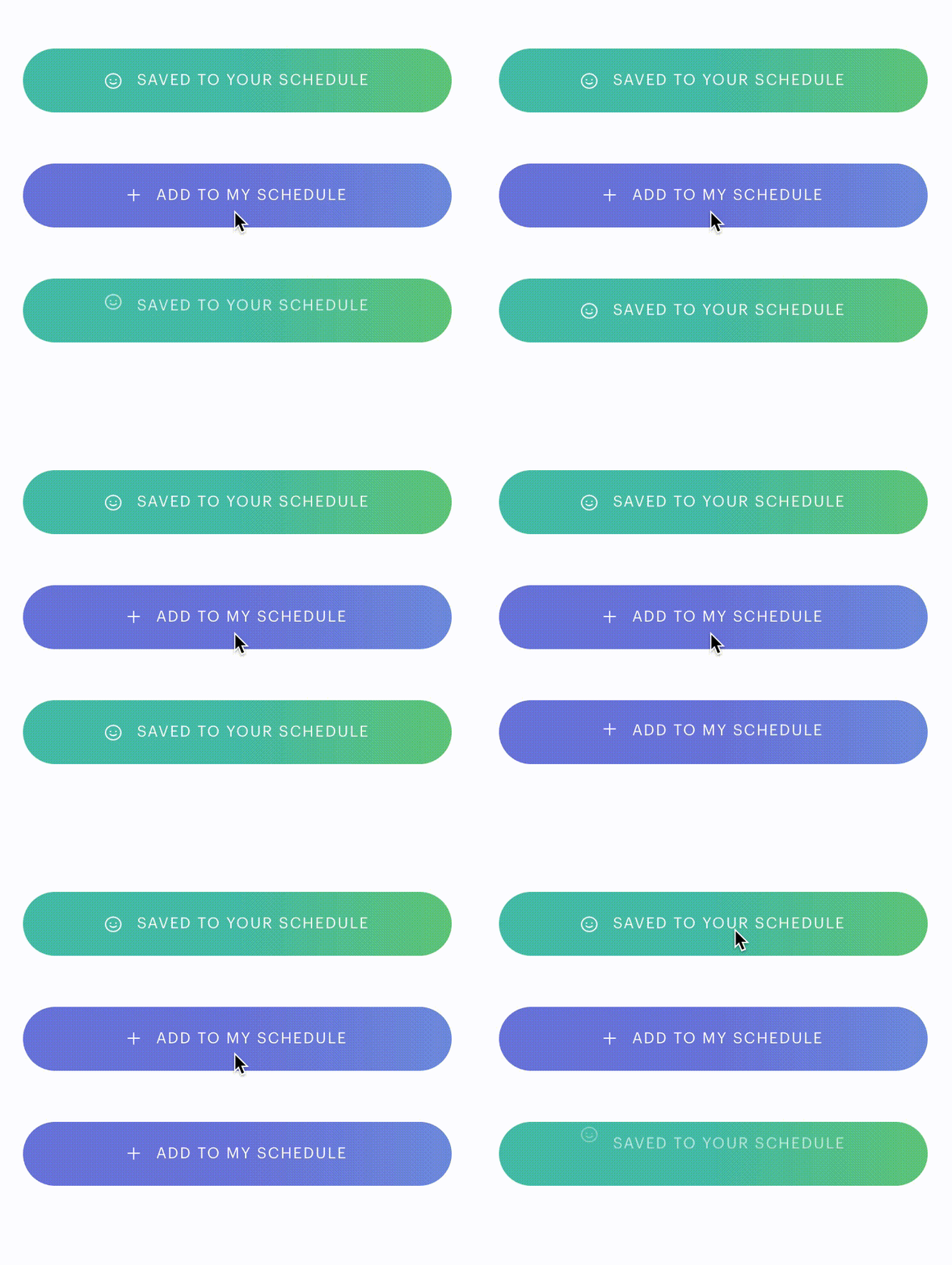
we can turn the app into a UI preview tool:

The examples defined for this button contain the pressed and not pressed states, and a third example which cycles back and forth between the two, in order to preview any transition animations.
This lets us really quickly tweak the visual style of basic components while working literally side-by-side with a designer.
If you want to make use of this, the <Playground> component should be re-usable in any React Native app. To enable it, all we have to do is swap a bit of code in our setup() function to load the <Playground> rather than the actual app:
/* from js/setup.js */
render() {
  ...
  return (
    <Provider store={this.state.store}>
      <F8App />
    </Provider>
  );
}
becomes
/* in js/setup.js */
render() {
  ...
  return (
    <Provider store={this.state.store}>
      <Playground />
    </Provider>
  );
}
The <Playground> component itself can be modified to change which other component is being imported within it.
